I design accessible products built on high-level design systems.

WCAG is my starting point, not a final check. I build sites that scale on solid, mature systems.

View projects How I work

Featured projects

2026Chilean Ministry of Culture + University of Chile (VEXCOM)

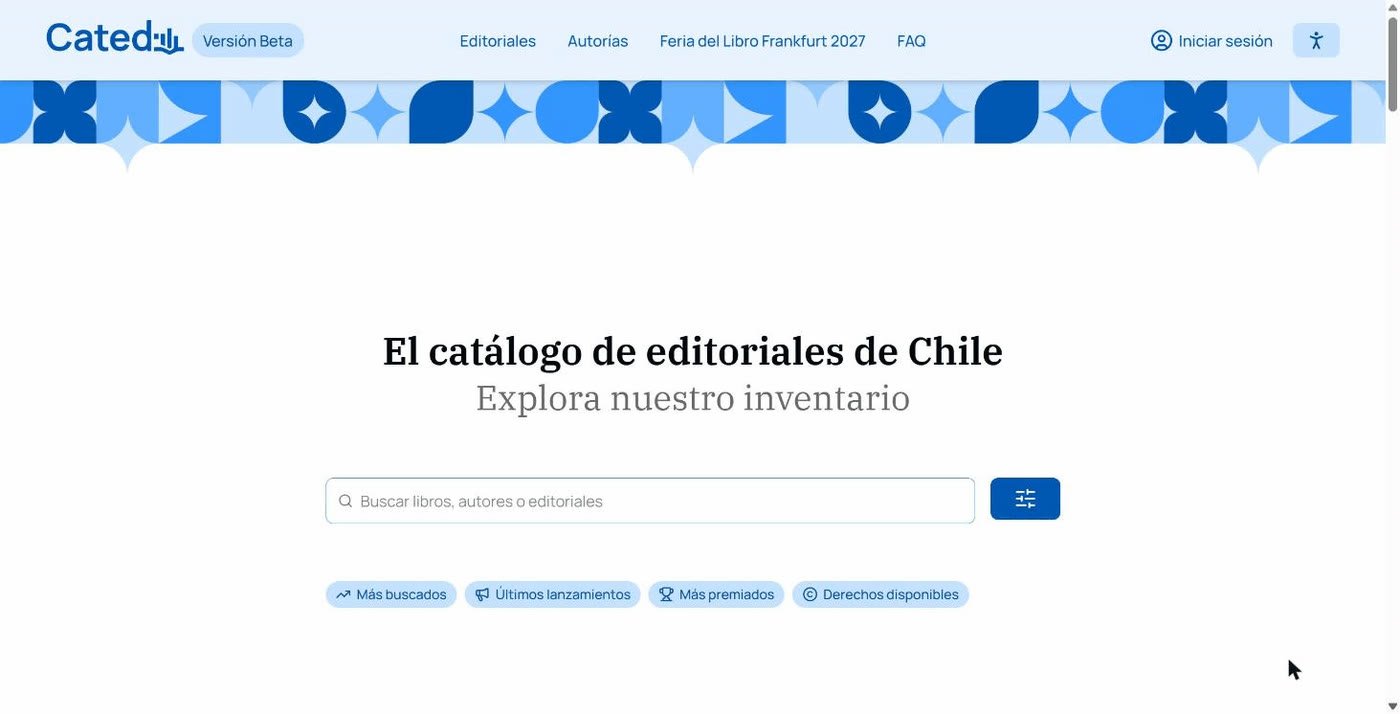
CATED: Chilean Publishing Catalogue

A public platform that brings together the books published in Chile, their authors, publishers and available rights. It is part of Chile’s preparations as Guest of Honour at the Frankfurt Book Fair 2027.

Role
UX/UI, design system and accessibility.
Challenge
Making a catalogue built on technical standards (ONIX 3.1) easy to browse for publishers, bookshops, libraries and foreign rights agents.
Key decision
Search as the front door, quick filters by intent and an accessibility menu with dark mode and text size.
Outcome
More than 3,600 titles validated by publishers in its first phase.
Visit CATED

CATED home page: the Chilean publishing catalogue’s search bar with quick filters.

2026Chilean Ministry of Culture + University of Chile (VEXCOM)

ROEL: Book Ecosystem Repository

A repository of data, statistics and publications on Chile’s book sector, designed to inform public policy with evidence.

Role
UX/UI, design system, accessibility and data visualisation.
Challenge
Making around 100 variables and indicators, and nearly 300 references, readable for people who are not data analysts.
Key decision
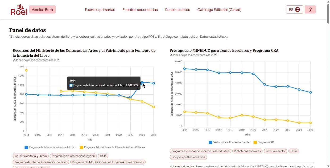
It shares CATED’s foundation with an identity of its own: same components, same accessibility, a different colour. Every chart shows its values point by point, together with its methodological note.
Outcome
Around 100 indicators and nearly 300 bibliographic references published in its first phase.

Visit ROEL

ROEL data dashboard: line charts on public funding for books, with one data point’s value displayed.

2025Tourism · Aysén, Chilean Patagonia

Casa Bahía Patagonia

Website for a refuge-style house on the shores of Lake General Carrera. It presents the house, local activities, how to get there and bookings, in Spanish and English.

Role
Web design and development.
Challenge
Selling an experience rather than accommodation: a remote destination, three and a half hours from the airport, for groups in search of calm.
Key decision
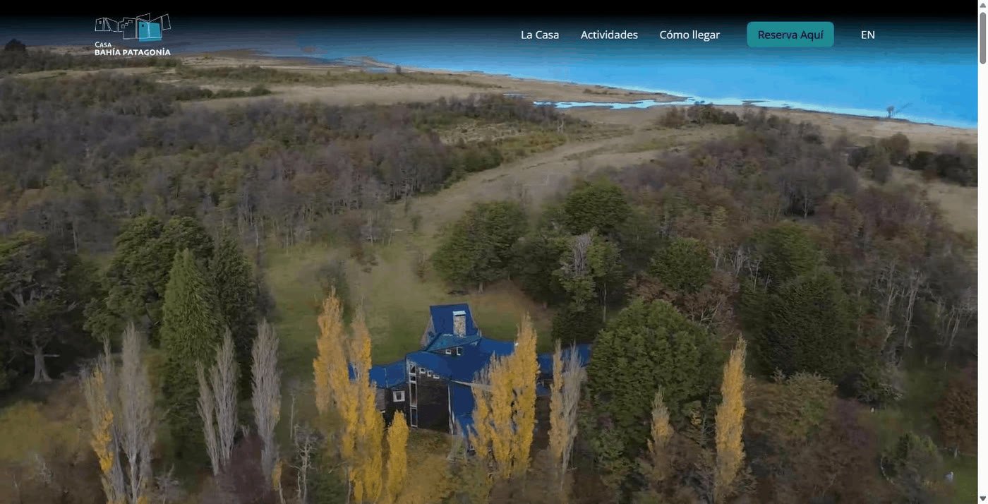
A contemplative look and feel: full-screen aerial video, full-bleed photography, generous white space and an unhurried rhythm that mirrors what the house offers. The map and bookings are always within reach.

Visit the site

Casa Bahía Patagonia home page: aerial view of the house among the woods, beside Lake General Carrera.

How I work

Accessibility first, systems always. I don’t design isolated screens: I design the rules that generate every screen, and I make sure those rules cannot produce an inaccessible result.

Multitenant

Layered design systems: one foundation, many identities

Every design decision lives in a layer of abstraction, and each layer can only use what the previous one defines:

  1. Token. The permitted value, with a name of its own: color_60, spacing_16. No colour or measurement is ever written by hand.
  2. Role. The function shared by many elements. The radius of everything that groups content is decided once, not component by component.
  3. Alias. The fine-tuning of a single piece, always pointing to a role or a token.
  4. Theme. A project’s identity: source colour, typefaces and a preset that fills every role at once. It never creates a new value or changes a rule.
  5. Component. Consumes only those layers, in CSS and Web Components, with or without a framework.

Multitenant by design. Several institutions share the same foundation and each keeps its own brand: switching themes changes the identity of an entire site without touching its HTML. CATED and ROEL are two identities on the same foundation.

A theme from a single colour. From one source colour the system calculates the full scale, the focus ring and the error, warning and success colours, which move away from the brand colour on their own so they are never mistaken for it.

Maintained as a product. Semantic versioning, automatic theme migration between versions and naming generated from the documentation: design and code use exactly the same names.

Layers of abstraction in a design system Five stacked layers, from bottom to top: Token, Role, Alias, Theme and Component. Three sites with different identities, Catalogue, Data and Festival, branch out from the theme on the same foundation. ComponentButton · Card · Accessibility menu Themesource colour · typefaces · preset AliasbuttonRadius → radiusRole_action RoleradiusRole_container → radius_m Tokencolor_60 · spacing_16 · radius_m One theme per site Catalogueblue theme Datared theme Festivalraspberry theme Same foundation,same accessibility,another identity.
Each layer uses only what the previous one defines. The theme changes the identity; the rules stay put.

Accessibility first

Accessibility by construction, not by review

Accessibility isn’t audited at the end: it is a property of the system. If a combination doesn’t meet WCAG, the system simply doesn’t offer it.

  • A colour’s number is its contrast. Every scale is indexed by lightness (CIELAB L* tone), not by hue. Since contrast depends only on luminance, a distance of 55 steps guarantees 4.5:1 for text and 40 guarantees 3:1 for borders and focus, whatever the brand colour.
  • No brand can break the rule. When a theme is generated, a colour’s saturation can be lowered but its lightness can never move. A new theme complies without being checked case by case.
  • Stricter than WCAG where it matters. The brand colour must reach 4.5:1 on its own, without relying on a border, so no component needs exceptions.
  • What identity cannot touch. A theme can adjust the focus ring but never remove it, and it cannot change the size of controls: the brand changes the breathing room, not the usability.
  • The person decides. Everything in rem, high contrast, reduced motion and dark mode, which also follow their operating system’s preferences. Try them in this site’s header.
Contrast guaranteed by the distance between steps The raspberry colour scale in 13 steps ordered by lightness, from 0 to 100. Between step 5 and step 60 there is a distance of 55 and a contrast of 5.73 to 1, enough for text. Between 10 and 50 there are 40 steps and 3.48 to 1, enough for borders and focus. Between 0 and 50 there are only 50 steps and 4.48 to 1, which is not enough for text. #F3144A scale, ordered by lightness Distance 55 · 5.73:1 · text ✓ 0510203040506070809095100 Distance 40 · 3.48:1 · borders and focus ✓ Distance 50 · 4.48:1 · not enough for text Aa Step 60 on step 55.73:1 · allowed Aa Step 50 on step 04.48:1 · not allowed by the system
A step’s number is its lightness, so the distance between two numbers decides the contrast, whatever the brand colour.

Other projects

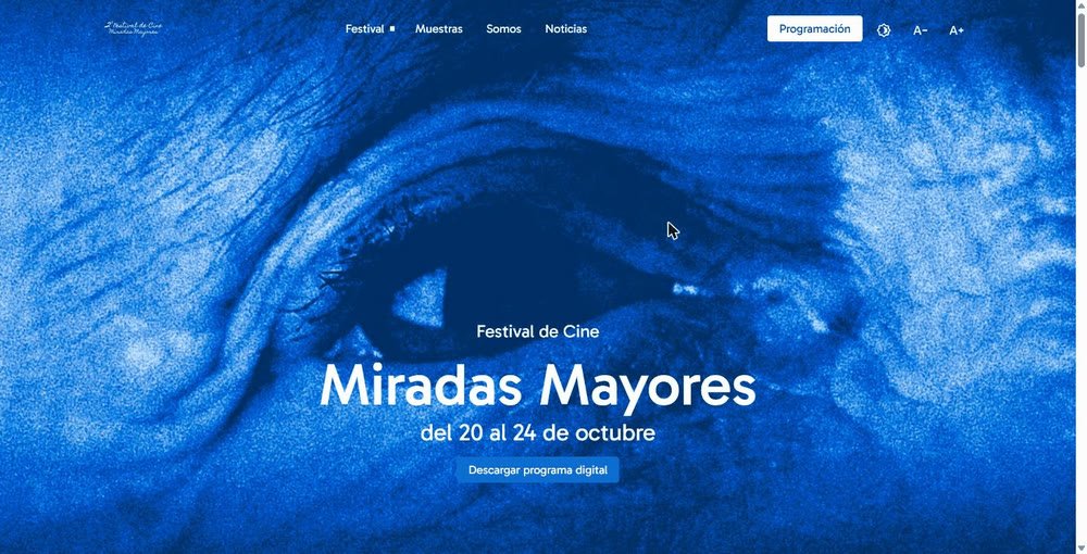
Miradas Mayores Festival home page.
2026Film festival

Festival Miradas Mayores

Cinema for older people, accessible by design. Text size and contrast controls in the header, and a programme organised by town.

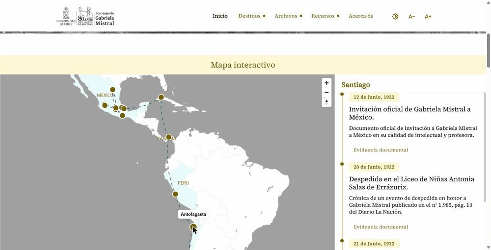
Interactive map of Los viajes de Gabriela Mistral with its timeline.
2025Archive and education

Los viajes de Gabriela Mistral

A historical archive turned into a journey. An interactive map and timeline with press cuttings, letters and photographs.

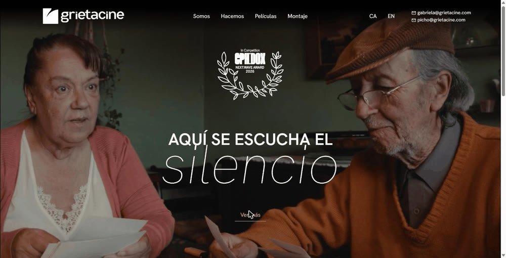
Grieta Cine home page with its film trailer playing full screen.
2025Film production company

Grieta Cine

A film production company in three languages. A full-screen trailer opens the site and lets the films speak first.

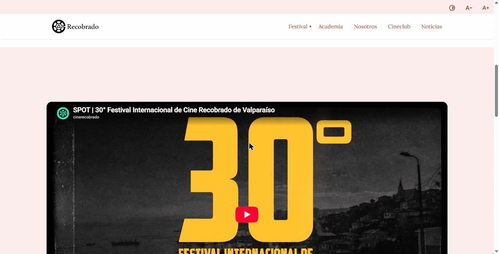
Cine Recobrado website showing the trailer for its 30th edition.
2025Heritage festival

Cine Recobrado

A festival since 1997, active all year round. Programme, symposium, academy and film club in a structure that grows with every edition.

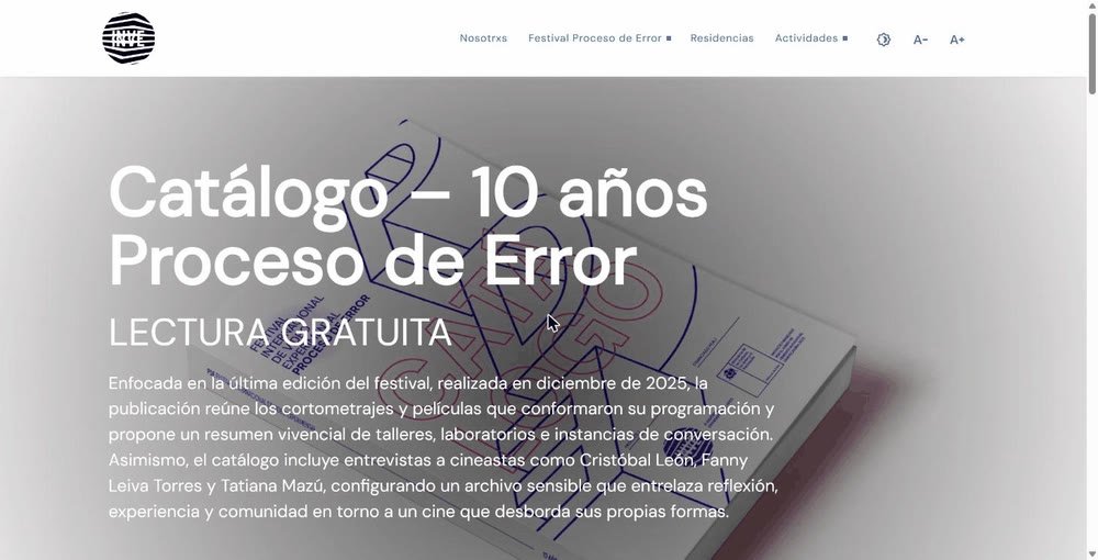
INVE home page featuring the catalogue for 10 years of the Proceso de Error Festival.
2025Arts platform

INVE

Expressive, with open calls that stay legible. Residencies, workshops and the Proceso de Error Festival, with an archive of past editions.

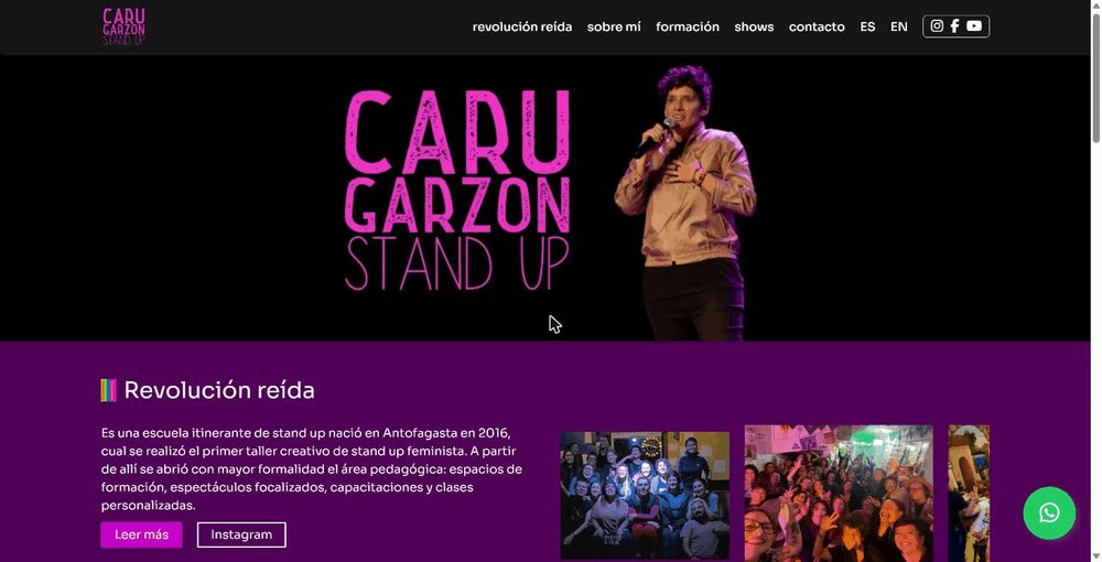
Home page of Caru Garzón, stand-up comedian and teacher.
2024Comedy and teaching

Caru Garzón

Personal brand, school and courses in one site. Shows, workshops by level, a student area and contact via WhatsApp.

Portrait of Matu Strauss

About

I am Matu Strauss, a UX/UI designer and web developer based in Valparaíso, Chile. My background in industrial design shapes a systemic approach to my work: I conceive each project as a system rather than as a collection of isolated pieces.

At the University of Chile’s Office of the Vice-Rector for Outreach and Communications, I developed a design system centred on accessibility. On that foundation I design and build large-scale public platforms, such as the Chilean Publishing Catalogue (CATED) and the Book Ecosystem Repository (ROEL), developed jointly with the Ministry of Cultures, Arts and Heritage.

In parallel, I design and develop websites for festivals, production companies and archives in the cultural sector. In every case I apply the same principle: accessibility is incorporated from the very first wireframe, not added as a later correction.

Design systems Web accessibility (WCAG) UX/UI Front-end and WordPress Public data platforms